 So I decided it was time to do a tutorial-I have been wanting to try it out for some time now. I am going to start out with a step by step picture tutorial that includes a ton of my favorite techniques to make some cute valentine cards. I was getting tired of all the reds and pinks and typical valentines so I started to think out of the box. I originally sat down to make some backgrounds and all of sudden this idea came to me after I made the first background. I think it was the colors-the oranges and yellows set off a "light bulb" in my head LOL. Here are the finished cards and below I will outline how they were made and what supplies I used. Also in honor of my very first tutorial I will be giving away one pack of Mini Distress Inks. Just comment below on my tutorial-let me know if you liked it and if you would like to see more. Leave a comment by 8pm Friday February 6th and the random winner will be announced next weekend on the blog!
Let's start with the background (same for all 3 cards). For the background I used my very favorite Tim Holtz technique Layering Stencil Monoprint which you can see here on Tim's Blog. I find that this technique works best using the Mini Distress ink pads as they are small and can get into smaller areas.

Start by inking directly to the back of the stencil with your favorite colors of mini distress inks. I find the more vibrant the final result. Gently tap or rub the ink pad directly onto the stencil.

Continue inking the stencil with various colors of ink until the stencil is covered with ink as seen below.

Next you will spritz the back of the stencil with water using a mister. For this background I used Pearlized water (a mixture of Perfect Pearls and water in a mini mister) which is a technique I learned from Jennifer McGuire Ink. The results are amazing! I just love the little bit of shimmer this gives.

This technique can be done on regular cardstock, a manila tag, or water color paper. My favorite water color paper is the Tim Holtz Distress water color cardstock- I love that it is precut and the results are beautiful!

Place the stencil (ink side down) on a piece of water color cardstock. I use a paper towel and gently place it over the stencil and press down with my hand to soak up any water/ink that has come through the stencil. I find that this prevents the ink from pooling under the stencil.
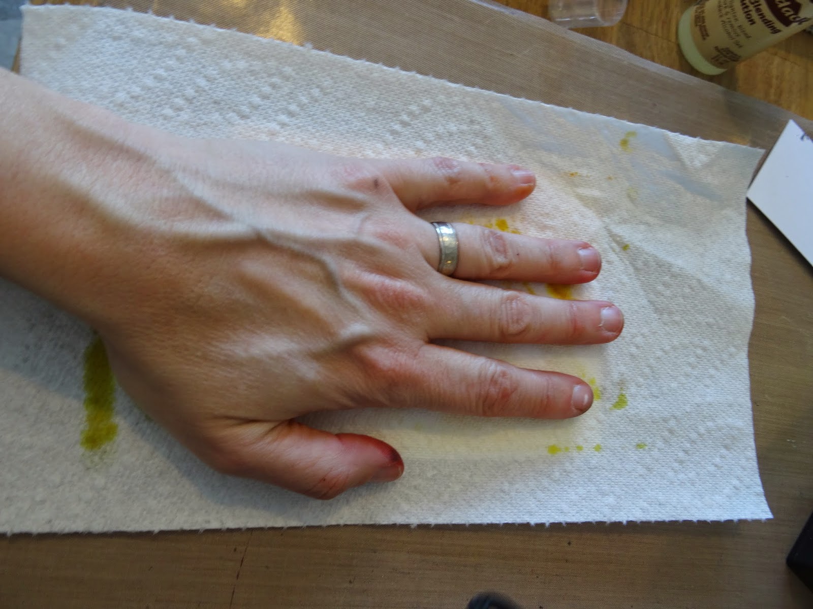
Remove the paper towel and stencil carefully from the cardstock.
Here is the result when the ink is still wet.
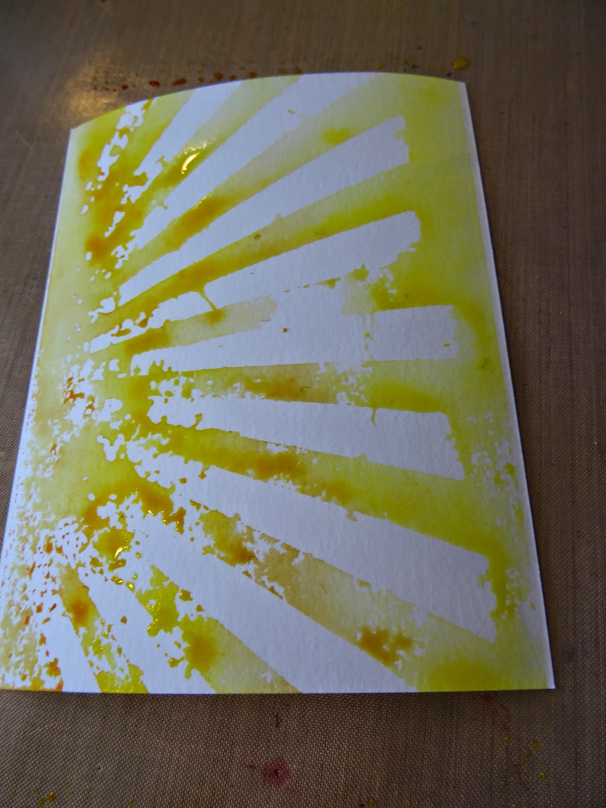
After drying completely with a heat tool - you will be amazed at the amazing blend of water colors that you get. It always looks better after it's dry!

Next, I used a stencil from Simon Says Stamp called Falling Snow. Place the stencil over the rays portion of the background and mask off the bottom portion with a paper towel,

Spray the stencil with Perfect Pearls Mist. I used blue here. I chose Perfect Pearls to match the pearlized watercolor look of the rays.


Take the paper towel and blot off the stencil as before. I love this effect because the Perfect Pearls also reacts with the Distress ink already on the background.
Now it's time to stamp the images! I used Versafine black pigment ink with clear embossing powder to stamp Tim Holtz's lightbulb blueprint stamp onto watercolor cardstock and again onto the background.

Wipe the yardstick with the antistatic embossing bag for the cleanest image.

Stamp with Versamark Black ink. I like versa mark for this because it will take the embossing powder and it gives such a crisp image.

Apply a generous coat of embossing powder, flick off excess and heat set.

Repeat the above steps to stamp the same image onto the background.

Another of my favorite techniques is watercoloring with distress ink. I just love this color palette and I am so excited that it is expanding this year with new colors.
I colored the bulb image on the plain watercolor yardstick and cut out to "pop" on the background image. I used Wild Honey, Squeezed Lemonade, Mustard Seed, Spiced Marigold and Pumice Stone.

Apply ink direct to craft sheet, mist some pearlized water onto inks and this becomes your palette. Paint the bulb to your liking, dry with a heat tool and cut out.


Apply Vintage Photo Distress ink to the edges of the cut out bulb image as well as to the background edges.
Next I made the heart for the center of the bulb. I saw that the drawing inside resembled a heart and decided to use an embellishment here.

Cut a heart from grungeboard (I used Tim Holtz Movers and Shapers Small Heart)

Cover one side with Festive Berries distress ink.

Apply Distress Stickles (I used Barn Door) with your finger over the inked side of the heart. Set aside to dry.


Use dimensional adhesive such as Glue Dots to "pop" the bulb itself, the word band bulb, and the heart onto the stamped background.

Sand the edges of Kraft Core Cardstock to use as a mat for the main piece. Attach with Ranger wonder tape (or your favorite adhesive).
As an afterthought I wanted to added some red hearts as a layer on the background. I would normally have done this prior to "popping" the focal image onto the background, but I was able to make it work.

Mask off Tim Holtz's Hearts Layering stencil with post it tape so that only one heart is showing in the corner to ink.

Using a mini ink blending tool (love these for stencils) carefully ink the heart without going over the edge of the stencil onto the background. You can mask all around the heart if you like to make it easier.
The last step is to attach the project to a card base and embellish however you like. I used chit chat stickers on two of the hearts and a Tim Holtz idea-ology arrow on the third.
Hope you enjoyed this tutorial and please leave a comment/question below!


